Friday, 29 November 2013

My Mock-Up Front Cover


This was my idea of my mock up front cover, I tried to develop the vintage look on it, but then on reflection I think the conventional bright, busy and fresh idea would be the better option. It not old would keep to the conventions but it would make the image look a great conventional piece that would be appealing to all readers. This image however doesn't abide by all of the usual pop magazine conventions. For example, pop magazines are usually bright, this is more of a neutral based idea that probably wouldn't be a iconic magazine.  The font is swirly and intricate and usually in the magazines the font is bold and has thick lettering to make it easy to read efficiently. The picture of the model isn't what you'd usually have either, she's pale and wearing neutral colours. This would be a good idea for a magazine if it was well established and you could 'get away' with ignoring the usual conventional ideas. It would also however suit the conventions of an indie magazine more. 
The maroon, pale pink and black coloring probably isn't entirely the colours that would suit a tweenage pop magazine for young teenagers because the blandness of the styles and colours probably wouldn't appeal much to them.

Then this is what I came up with as a mock-up that would fit the conventions of a usual pop magazine. For the tween age and fitting the tween usual conventions and what I would have to try and make my mock look like.

Thursday, 28 November 2013

Production Planning

28th November- Detailed Mock Front Covers.
29th November-Detailed Mock Front Covers.

5th December-Shooting Photographs.
6th December-Shooting Photographs.
(20 photographic photographs)

12 December-Photoshop Manipulation.
13 December-Photoshop Manipulation.

19th December-Final Design, Placing it together.
20th December-Final Design, Placing it together.


20th December-DEADLINE Front Cover.

Friday, 22 November 2013

Examples of Typestyles and Fonts


The whole of my magazine is following the Vintage pastel theme. The font should contrast with this and match the whole aims for the magazine. I selected a few fonts, some would look good and are suitable but others probably wouldn't be desired. Here the ones I'd like to use are, Always On My Heart, Jenna Sue, Little Bird and Callie Hand.
I think these fonts are nice and vintage looking but, some may not be bold and or wouldn't entirely be seen properly, leaving out it's possible full potential.

Also in Pop magazines the fonts often arn't black or white they link into the colour scheme and portray a certain colour within that. For example;

In a bright pink colour such as this one, it would link into the scheme and also would appeal to the readers because pink is an iconic feminine colour.
A blue colour like this would also be used however, it may be hard to read properly if looking from a distance. 
A neon green colour would also be used however it isn't as feminine as other colours meaning it wouldn't appeal to the all girl target base.

The main conventional fonts I am going to use are bold and plain because it's simpler to read and it is typically what you'd expect to see. 

Thursday, 21 November 2013

Examples of Costuming


I wanted my costuming to look young and idealistic to young people who may be reading the magazine but I also wanted it to look age appropriate for the Popstar too, who could be of any age. I wanted to go for a mainly pastel look, but with a bright patterned or highly jeweled added extra for example necklace or a pair of shorts with a stoned pocket. I think the colour schemes for my model here would be purples, pinks and maybe even blues.
Any of the looks in the video would be more than suitable for this whole image, it all would create a good image. I will try to recreate them but putting an added extra onto my aspirational 'look'.

Examples of Hair Styles


This is one of my main idea's for the hair styling. As I want a girl on the front cover of my magazine.  I feel like I am able to do the make-up and styling myself but I feel like I wouldn't be able to do the hair styling to a standard that I would like and that I want my models to look like so, I have called upon a connection that has experience doing hair and that would enjoy assisting me in this part of the production process.


Tuesday, 19 November 2013

Examples of Make-Up

This is my example of Make-Up. I looked for a young, pretty and natural look. The eyes, complexion and cheeks are neutral. This is important because even though of of my main focus points is Make-Up, I don't want the children to feel like the make-up is a necessity to become like one of their favourite stars. The lips however are quite bright. This is in my opinion acceptable because the rest of the male up is pale and diluted. Therefore it is having one main point and cancelling out the other making it marginally acceptable. This is also a good look to create a vintage but also young picture. When creating my make-up look I will adapt the look to make it my own adding a small element of a light pastel eyeshadow. This will demonstrate a bit of youth and it could add to the young child's liking and make them relate to the small element. I have the skills to do my make-up on my own model for the shoot however I will need to invest in some new eye shadows in a palette (for convenience)  to make it exactly how I'd like.

Thursday, 14 November 2013

Photographic Influences

These are the initial ideas that I think would compliment my magazine well. They suit the 'look' i'm going for extremely well and are all of a feminine look which is my aim. I'd also like my models to have an intricate hair and make up look. Although my magazine is aimed for tweens and I dont want to promote the obsession and promotion of make up but for this chosen photoshoot I want make-up to be one of my main focus points and what I'd like the whole picture to revolve around.  

I 
I like this image because of the way it has used young, fresh and feminine colours to create a high quality picture. The model is wearing a top that has flowers on to create a main vocal point, and every colour in the image compliments and contrasts the other, even the models lip colour and the background work together well. The way she has her hair is a young and up and coming hair style and it works really well, young girls aspire to be like these girls and they want to look like them, be like them and with this hairstyle it is suitable for that. It's a very angelic option that creates a pretty look. The shot type is a medium close up, portraying the models expression. This picture is originally from Vouge magazine and they focus alot on  their make-up and fashion. So the close up shot could be as a focus point from the make up. I would like a girl band on my front cover but this would look nice as an image as part of my double page spread. Where each 4 of the models will have their own image and all 4 of the pictures will be lined to create the certain composition. 

The thing I like about this image is the 4 girls all have a very different costume but it works together and contrasts really well to create a trendy look. They're all wearing the same types of clothes but they all look different and portrays each members individual own unique style really well. You can tell each member has their own distinctive style which has warped really nicely to this chosen costuming from the producer of the shoot. The girl on the far left, here has quite a tomboy style but with a little bit of femininity. For example, Her combat pants, large shoes and still camo belly top looks a little masculine but her little crown shows she has some girly-ness in her too. The shoot was made for Teen Vouge and like the image above the main picture was probably made for fashion and publicity purposes. The long shot shows each element of this well, portraying they 'care' about the clothes they wear and as it's what's in fashion it probably is a demonstration of what's 'in'. The clothing choices are probably abit too revealing for the tween generation but it still develops and portrays the same things.
I am aiming for something along this wave-length to be my front cover but with one model with a more young, vintage, girly theme. It will be a fun image on a set such as an Ice-Cream parlor or a fun but fashion, hair and make-up based look in a studio with the correct lighting and a selection of vintage props. 

My Reader Profile


 I have done abit of research with somebody who is a match to my reader profile. I asked her various questions on what she likes and what she enjoys doing...

The Questions where...
What is your favourite colour?

  • Who is your idol?
  • What do you enjoy doing in your spare time?
  • Who is your favourite singers?
  • What is your fashion staples for this winter/year?
  • What is your favourite televison or game? 
Then I put together all  of their idea's to create this mood board.  


Props and Locations

For my image i'd like to do a 'young' and 'fun loving' image that captures the artist having fun and enjoying themselves. Maybe this would be more suitable if my model didn't do a to serious photo. I think somewhere that teens would go to have fun. For example the amusements, an ice cream parlor, the cinema and maybe clothes shopping. For example;

The Fairground.
In a fairground, this is an unusual and fun setting. The props could be 'admit one' tickets, large sticks of candyfloss, games or even giant teddies and presents. The typical fairground iconography. It would be hard to complete this surrounding area now, because the time of production would be December/January and most fairgrounds are out of action in that time. It would be a really fresh and new idea but because of the time of production, I don't think it's a very achievable idea.

The Ice Cream Studio. 
My next idea is in an Ice Cream parlor. It suits my pastel-vintage theme for not only the image on the front cover but my image for the whole magazine.
It is a very girly location and with my models there in pink, purple, yellow and blue small 'cupcake' dresses it could create a good well rounded picture. The props could be items such as an ice-cream, sweets and such like.This picture would be sweet and preppy, it'd be perfect for my magazine. But due to my timescale and available resources a real parlor isn't available but, I could always create my studio setting into one and try to make that a possible idea.

A Studio Setting.
This is probably my best, most achievable idea. I am basing my whole photo shoots on the fashion and make-up of the models and with a studio setting that would let me and enable me to do that and create the best picture possible.  The lighting would be accurate and also I could add any props I could want for example I could add any vintage hanging ornaments and also If I wanted to create a setting where the real thing just wouldn't be available that could be a good idea too. I could put any small or large apparatus in the setting. A minimalist picture is the best idea possible so that is going to be another one of my key criteria for my images.

My Key Criteria for the images; 
(the criteria I've set myself for my pictures based on how I'd like them too look)

  1. It must be suitable for tweenage girls(aged 11-15/16).
  2. Make-up and fashion is a main focus point.
  3. The colour schemes are pastel colours(for the whole magazine).
  4. It must be vintage to match with the whole theme of the magazine.
  5. It must have a female artist on the front, that would be admirable for young girls. 


Thursday, 7 November 2013

Pop Research

My Audience Media Profile

This is what I have created for my Media Pack it ha all of the information about who would read my magazine and what other information i'd need to be able to create a sucessfull product.


Audience Media Packs

This is 'We Love Pop's' media pack explaining everything about the audience that reads their magazine and other crucial information.


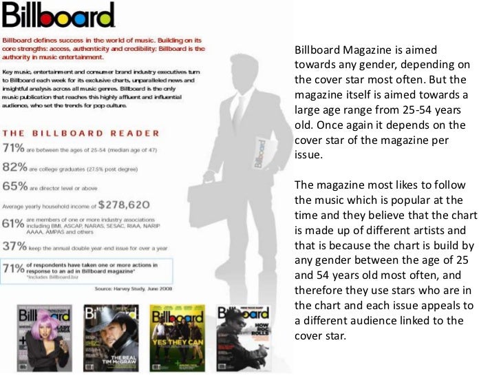
Then this is also 'Billboard Magazines' media pack.


Media Pack for Billboard Magazine

My Initial Idea's

Wednesday, 6 November 2013

Music Magazine Liiar Analysis'

After I had the idea to create a pop magazine, I started looking for alternate magazines to analyse to begin to get a good idea of what I should think about including.